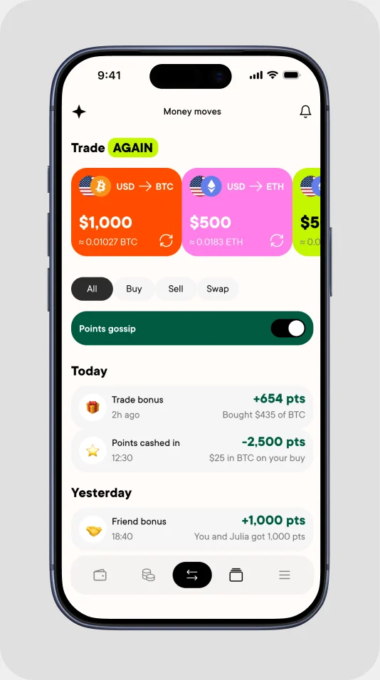
Let’s talk
← All work
Mobile appFintechLoyaltyConcept

Designed a loyalty program that gives crypto traders a reason to come back

Crypto Points is a loyalty program concept for a crypto exchange app. I took it from research and JTBD to a design system and final UI.

Company name and real data are hidden under NDA

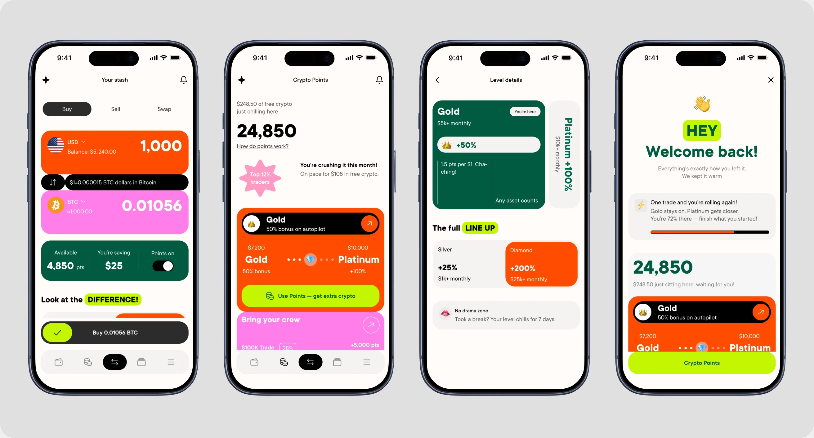
Four key screens: buy screen with points, Earn tab, tier details and Welcome back
RoleProduct Designer, solo
TimelineFeb – May 2026
TeamSolo, as part of a Senior Product Design program
ScopeMobile app, research, design system, UI
100+job statements behind the screens
4core problems in focus
4 mofrom research to final UI
1core user: the active trader

Overview

Most new users of the exchange made one trade and never came back. But people who stayed active for their first two months usually stayed for years. So the business needed a reason for new users to return, and those first two months were the window to give it to them.

The problem

People came for one trade and left. Nothing in the app rewarded them for staying, so the next trade could just as easily happen somewhere else.

Focus

I designed for one core user: the active trader who trades several times a week.

  • I did everything myself: research, JTBD, IA, wireframes, design system, UI and specs
  • The project was part of a Senior Product Design program, but it was built on a real product with real user data
  • I explored onboarding, notifications, repeat trades and referrals in wireframes, then left them out of the final UI to keep the focus on the main jobs

Process

01

Discovery

Audit of the current app, competitors and daily references.

02

JTBD

100+ job statements, grouped into 6 areas.

03

Wireframes

Every screen starts from a job.

04

System & UI

Components first, then final screens.

Job

When I use points to lower my fee, I want to see exactly how much I save, so I trust that the bonus really works.

User flow

Before / after price → Savings confirmation → Transaction receipt

Wireframe
Wireframe of the buy screen
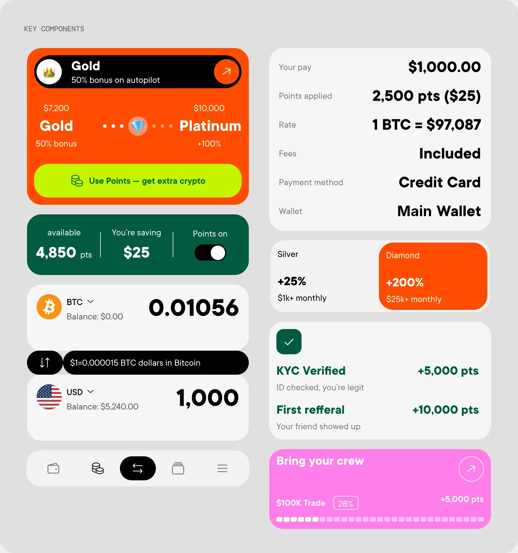
Key components of the design system
I built the design system before the final screens, so every screen used the same parts.

Key decisions

Decision 01

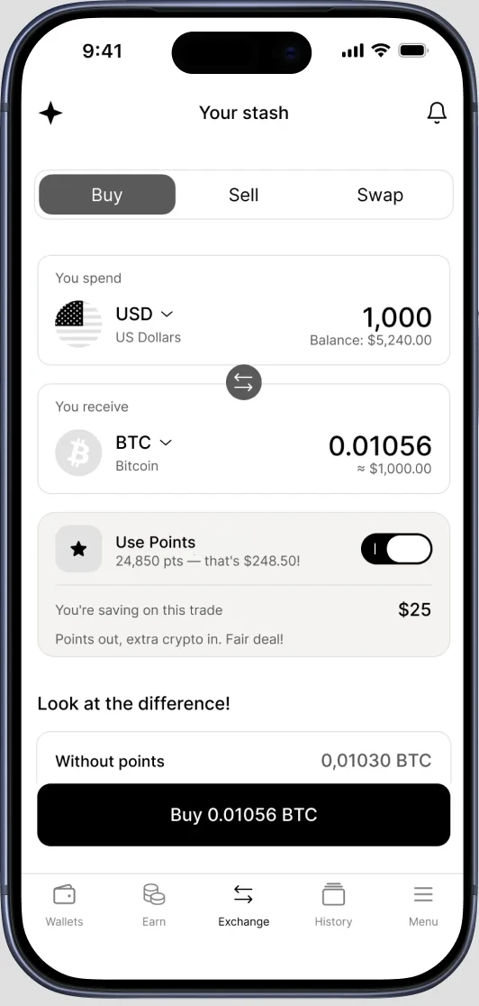
Points live inside the trade

The problem: Points felt separate from the main action, so people forgot about them.

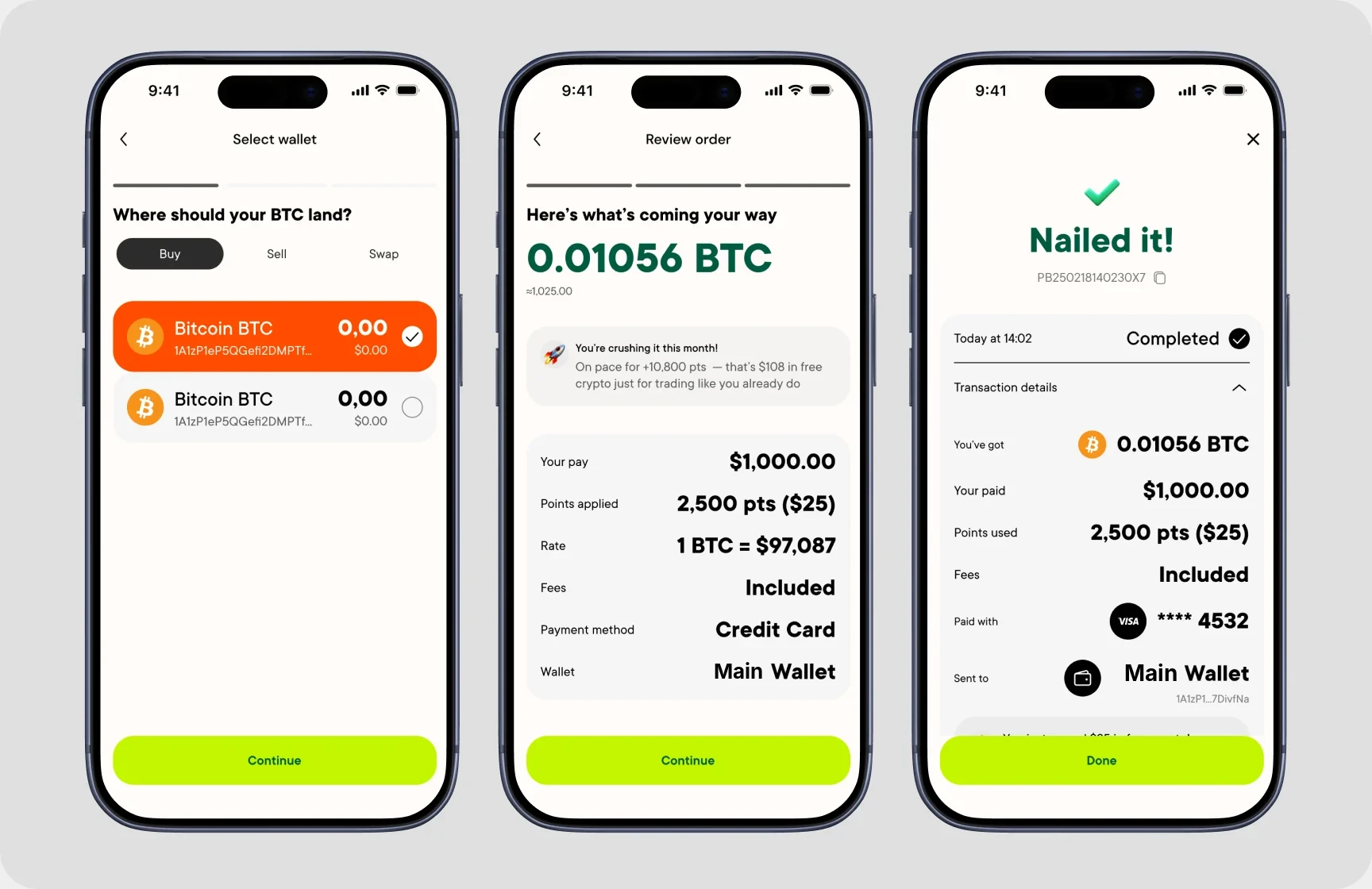
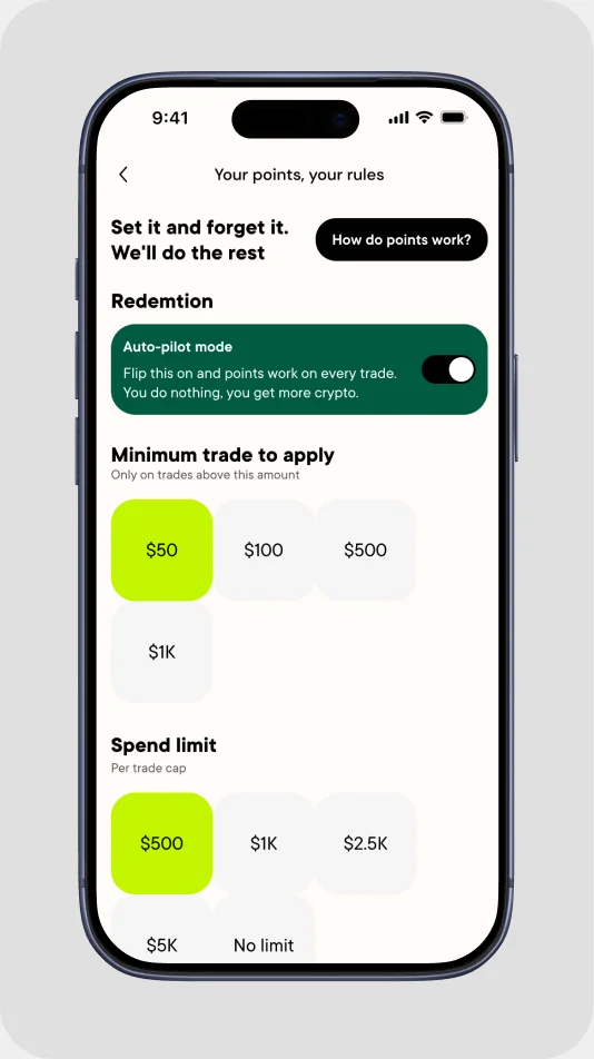
My solution: A “Use points” toggle right on the buy screen, with the rate before and after and “You’re saving $25”. One tap, and the result is visible right away. Points only apply above a minimum trade, so they don’t get spent on tiny purchases.
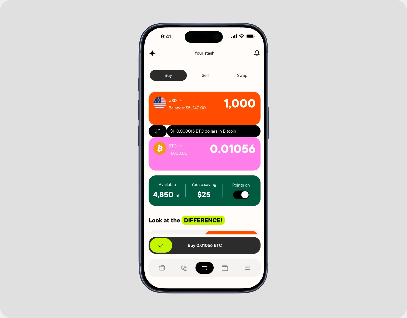
Buy screen with the Use points toggle

Decision 02

Show value in money, not in points

The problem: People didn’t see points as something valuable.

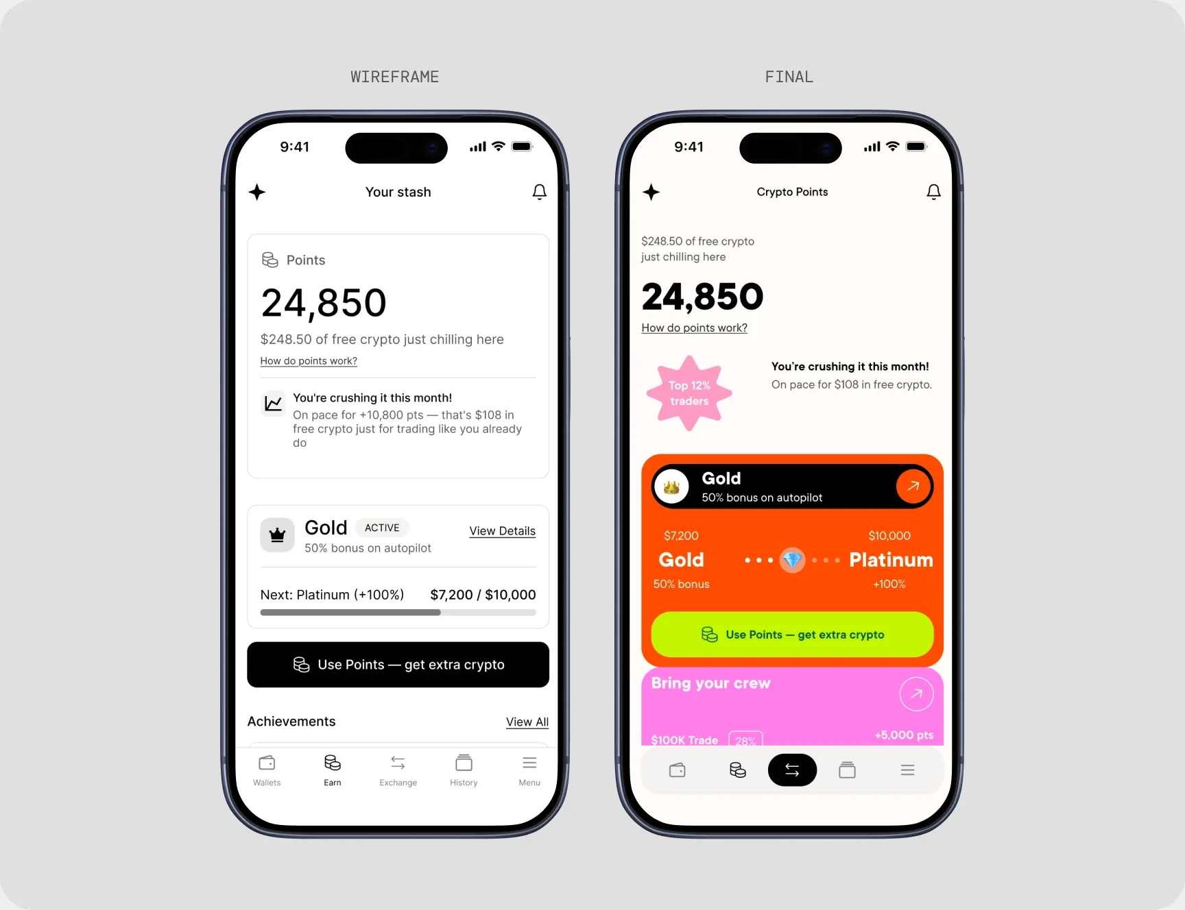
My solution: Show points as real money and crypto, add social proof (“Top 12% traders”) and a progress bar to the next tier.

Earn tab: wireframe and final design side by side

Decision 03

Tiers without fear of losing status

The problem: People were afraid to lose the status they had worked for.

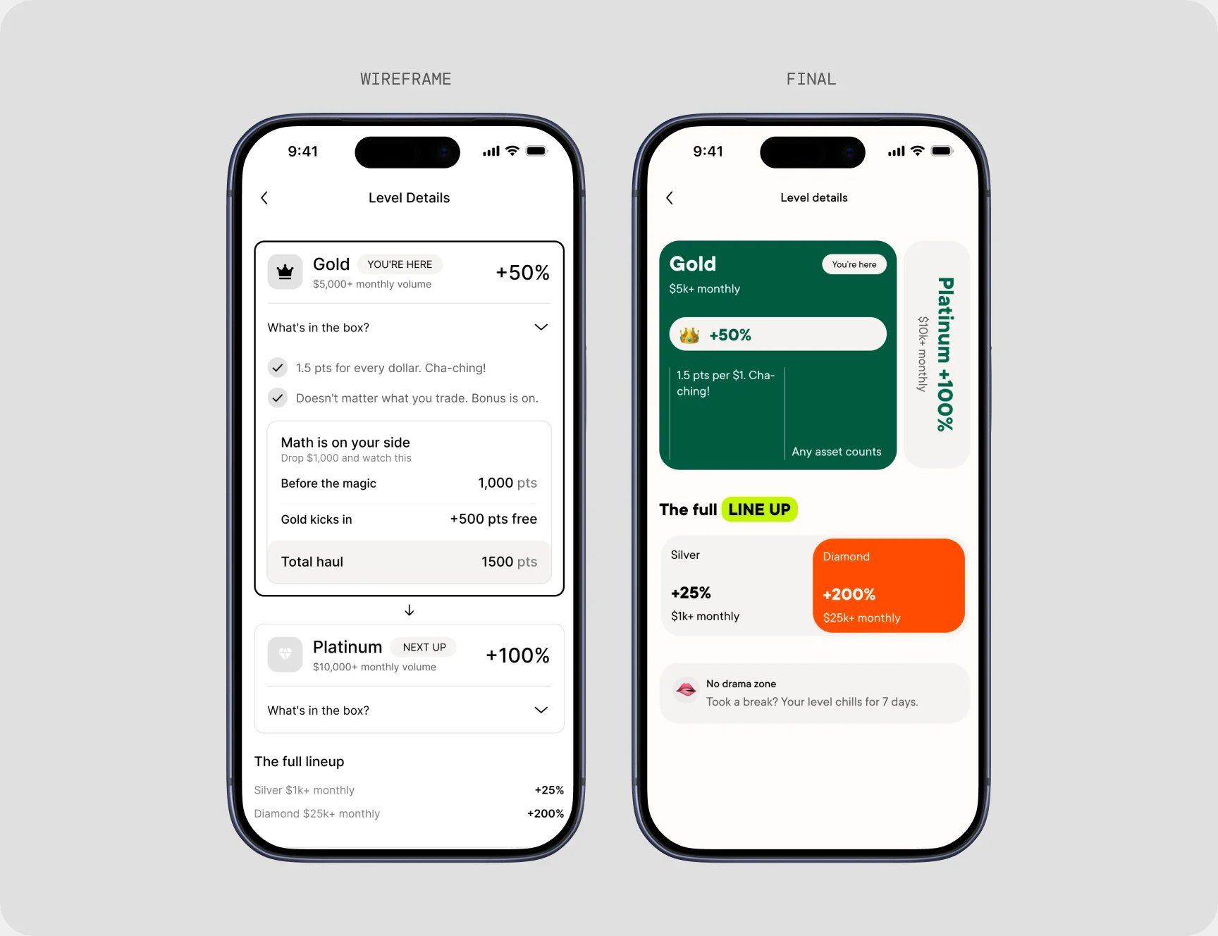
In the wireframes, tiers were a long list with details hidden in dropdowns. In the final version, the current tier and the next one sit side by side, so the next step is always in view.

My solution: Clear multipliers from +25% to +200%, and a 7-day grace period if you take a break.

Tier details: wireframe and final design side by side

Decision 04

A loop that brings people back

The problem: People didn’t come back after the first trade.

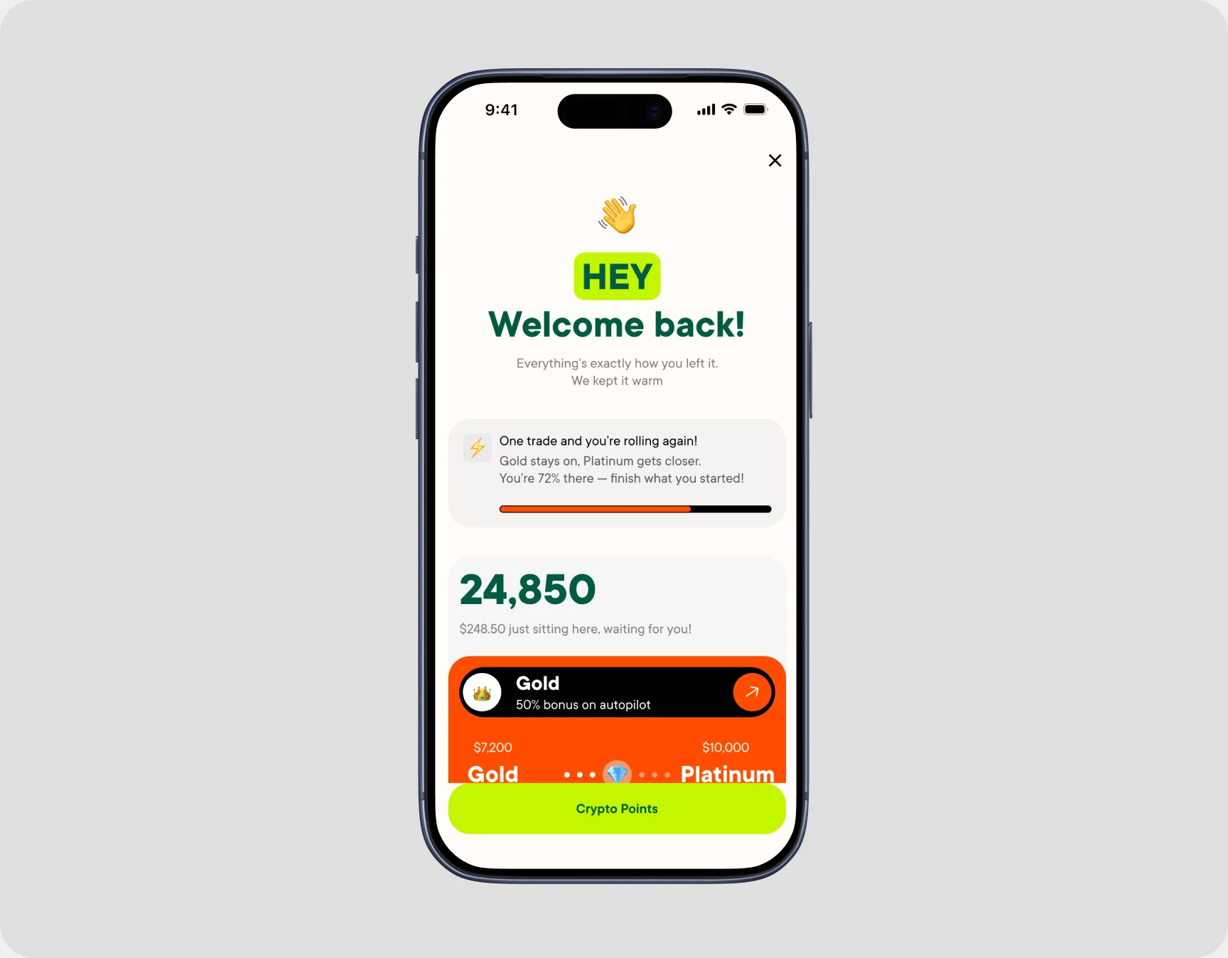
My solution: A “Welcome back” screen that shows how close you already are (“72% to Platinum”). Progress stays saved, and one button takes you straight back to trading.

Welcome back screen

Screens

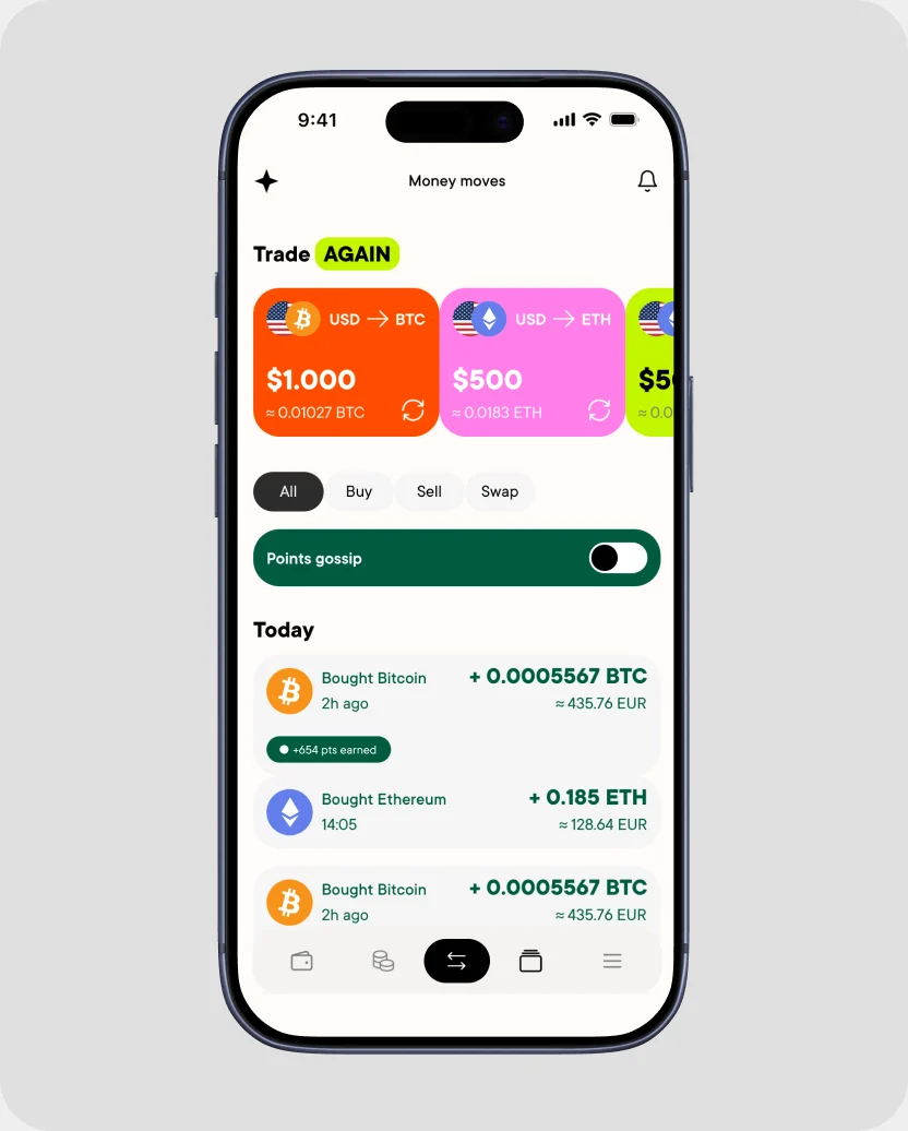
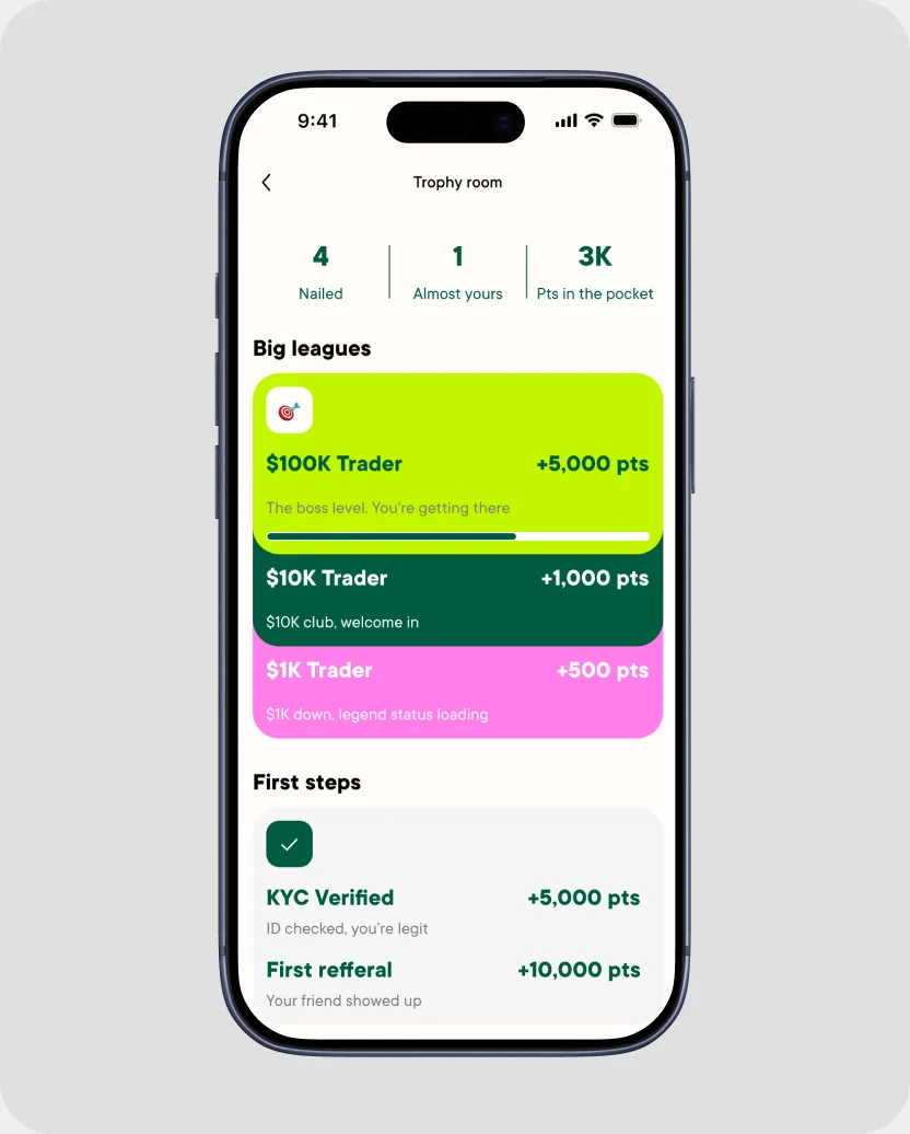
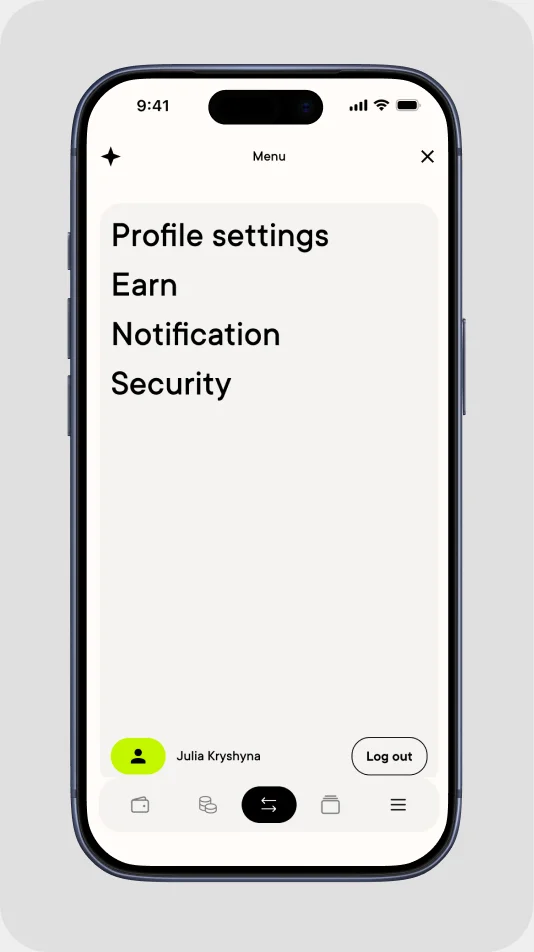
History and achievements · Buy flow: wallet, review, transaction details · Points settings, menu, short history

Outcome & learnings

  • I presented the concept to the team. The JTBD research and tier mechanics went into the company’s real loyalty program
  • The design system is ready for engineers: tokens, Variables and three levels of components
  • It’s a concept, so there are no live metrics yet. Next step: test the points toggle and the welcome back loop with real users

What I learned

I used to start from a brief and go straight to screens. This time I started from jobs, and every screen had a clear reason to exist. That meant fewer rounds of changes and an easier story to explain to the team.

Get in touch

Have a product to build?
Let’s talk

Write to me about a role or a project.